 Experts Need expert help? Don’t hesitate to talk.
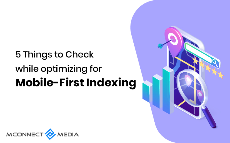
Google used desktop crawls for indexing before July 2019, but now it will use mobile crawling for indexing every website by March 2021. In short, the mobile version of your content will now be indexed and ranked by Google.
There’s good news: almost 70% of websites use mobile-indexing on more than half of the web pages that are displayed in search results. Moreover, Google has demonstrated that most of sites are now ready for their new mobile-first indexing system.
You might be concerned about how your website will rank without mobile indexing. The chances of mobile-first indexing affecting your ranking are high, because it clearly hurts you and your business. The best way you can ensure a good ranking is with the mobile-first index.
We will assume, for a while, that you have a mobile-friendly or a responsive website. It might be a good idea to get that sorted out before going through the tips. You may use a tool provided by Google to determine whether your site is optimized for mobile devices.
Let’s look at five mobile-friendly tips you can implement now to ensure your site is mobile-friendly. Additionally, we will explore how mobile-first indexing makes a difference and how it affects SEO.
How Does Mobile-First Indexing Work, and How Does it Impact SEO?
First, we will discuss how mobile-first indexing works and how it impacts SEO. When we index a site, the search engine crawler reads and stores its information. Search engine crawlers are like libraries, storing the information of your website in their index.
You’ll have rankings after your website has been indexed. Search engines use the information you store on your website to rank your site in search results. According to your search query, search engines will rank your page based on your content’s quality and relevance. Meanwhile, indexing is essential as rankings are based on it.
Mobile-first indexing does not mean you should ignore the desktop version. Basically, Google will index the mobile-friendly content on your site and make it a priority. Results will vary depending on whether you search on a desktop or a mobile device. Thus, both versions must be worked on.
How Do I Optimize for Mobile-first Indexing?
If you haven’t yet joined the mobile revolution, now is the perfect time to get started. In essence, we live in the era of the smartphone, a world in which everything begins with a mobile phone. Here are some tactics to ensure your website is mobile-friendly and converts better.
1. Make Sure You Speed Up Your Website
Websites that load slowly are like a fish out of water. In other words, it won’t serve your visitors or your business. In Google’s opinion, your site should load within two seconds. To deliver a seamless experience to your visitors, you need to optimize the speed of your website according to Google recommendations.
Here are some tips you can consider and maximize in order to speed up your website.
- Optimize image
You may notice a slowdown on your website if you have large images. Your website can be speeded up again by optimizing and making the changes.
- Minify code
When source code is minimized, it means that all unnecessary characters are removed without changing its functionality.
- Reduce redirects
A large number of redirects can slow your site down, which is a major concern in running it at optimal speed.
2. Make Sure You Use a Responsive Web Design
The importance of a website with a responsive design has long been publicized by Google. It’s a site that automatically adjusts the content of your web site to different screen resolutions and window sizes based on the URL.
Because SEO must know more than the coding of your website, you need to consider a responsive design. For ranking checks, they need to understand how to use design. If you want your site to be responsive,
- Flash should not be used
- Do not use popups to frustrate users
- A scroll and tap interface for easy use
3. Make Sure You Check For Structured Data
The third and most important thing that needs to be done is checking for structured data. If you have structured data on your site, make sure it is available on both the mobile and desktop versions. Make sure the data you are using is accurate and complies with your website. Therefore, you must take this into account when creating a mobile-first index to avoid potential issues.
4. Make Sure You Consider Checkout Process on Mobile
Next, you need to streamline the checkout process for mobile devices. Since most customers begin their purchase on one device and complete it on another. Providing mobile customers with an easy checkout process is vital.
Due to the fact that most people make final purchases on mobile devices, you should consider the checkout process on mobile devices. By doing so, you will accelerate the conversion process and remove barriers.
The checkout process for mobile devices should be optimized to improve conversions by keeping a few elements in mind.
- Accelerate the process
Although it may seem obvious, the speed recommended above can facilitate a sale.
- Reduce the amount of unwanted information
Second, create a checkout button or create a checkout page on your website that is mobile-friendly. While your marketing team needs to know everything about your customers, from the email address to the date of birth. Do you think you should also know the customer’s birth date? What this means is don’t ask for anything that isn’t necessary or adding value to your business.
You are more likely to get high conversion rates if you provide a checkout that completes within a blink of an eye and your customers will be happier to provide you with the information you request.
- The navigation should be smoother
You can save your visitors and customers a lot of time by doing this. Since you’re providing a smoother navigation, they don’t have any problems finding what they’re looking for and will come to you.
5. Make Sure You Optimize for On-Page
There are very few areas that you can work on and improve when it comes to mobile SERPs. To help GoogleBot identify and understand who you are, you can improve your title and description. The result will be a higher CTR and enhanced rankings.
Summing Up
As a result of implementing and working on things mentioned above, you will be in a far better position to rank on Google’s mobile-first index. Before you make any of these changes, we recommend you consult an eCommerce agency.
Are you interested in optimizing your site for mobile-first indexing? M-connect Media can help you. Our eCommerce experts and Magento developers can assist you in making necessary changes to your site and correcting it in accordance with Google’s new system. For more information, contact us now.


